- info@500tech.com
- HaYetsira 19, Ramat Gan
Earlier in part 1, I’ve covered the general organization of Mimic application, including the status bar, Quick Edit and opening and closing of the full editor.
Now let’s see how went the main work on the full editor. The “Mimic” button moves to the bottom to match with the position in Quick Edit. Settings follow:

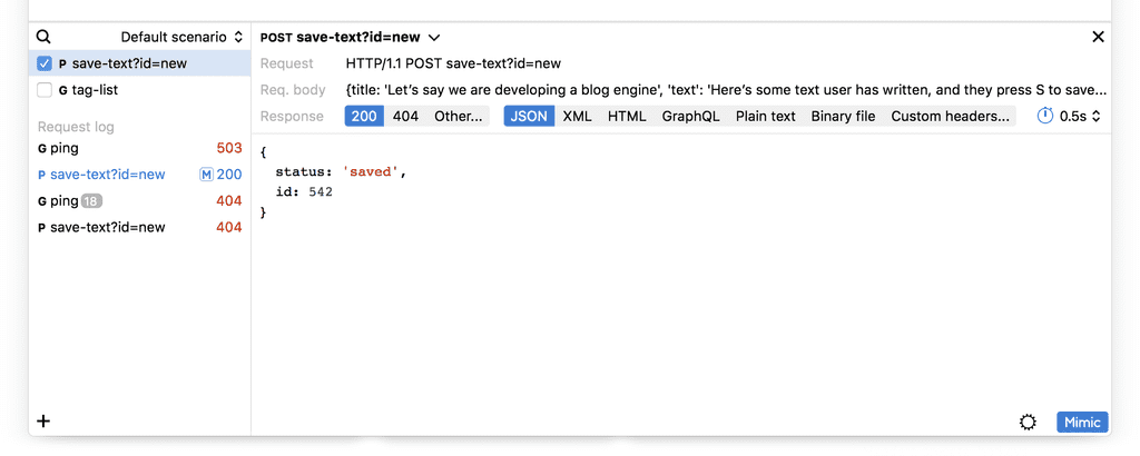
The close button is added to the top right corner for the convenience, but pressing “Mimic” also closes the editor. Also notice the “+” button in the bottom left corner. I had to add an ability to set up a new mock without the need to capture a request from the developed application. In the list on the left a new “M” symbol is added for mocked requests and also a way to represent many similar requests (the number “18”).
The next thing to think about is the way to edit not the response, but the mocked request itself. So the previously designed interface becomes part of the Response tab, and a new Request tab gets added:

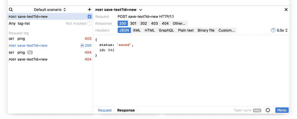
Also, the list on the left becomes wider to fit longer requests. And the checkbox moves to the right to reflect the recent change in the Quick Edit bar.
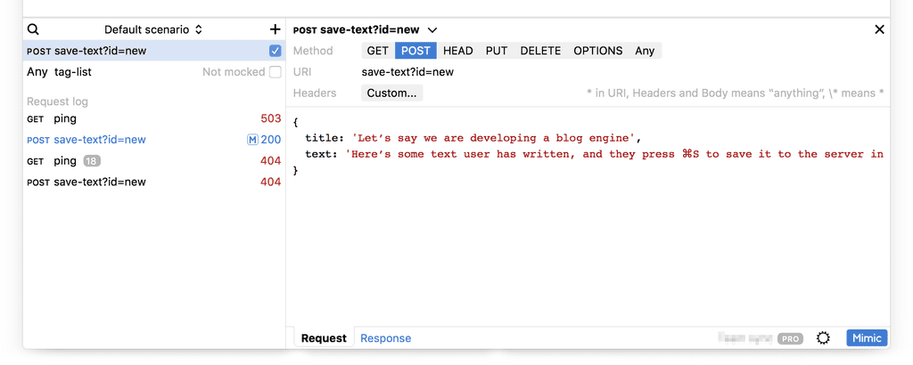
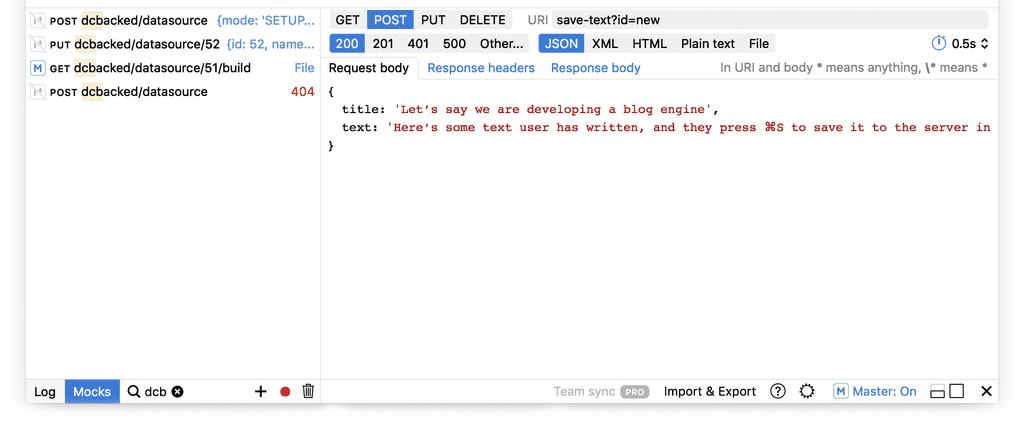
The request editor gets the ability to change the method and the URI, to set up custom headers and body and, most importantly, use wildcards:

So, on the left the log is a separate thing from the mocks list. But it feels increasingly strange.
First of all, the log will obviously be much longer than four items. It would be inconvenient to work with in this small area. Second, there is a logical problem. The log is for the developer to quickly pick a recent real request to replace with a mock. It also makes sense for the previously mocked requests to appear in the log, in blue and with an “M” symbol — as you see in the picture. However, if we show them, they have to be editable and there should be a way to enable and disable them. But how do you disable a mock that has been already used in the past and logged? Or what if I had several requests like this already, and some of them were mocked, and I disable one of these mocks from the past? This is strange and unpredictable. The list becomes a mixed bag that is both a log and a mock configurator. I have to do something with it.
So it is time to re-think the left list. I separate the two lists:

The mocks list gets a lot of though this time. I add grouping, make the list much more informative and move the checkboxes to the left, where they belong. Icons for removing a mock (the minus) and search (the loupe) are added. The tabs for Request and Response move to the top. On the right, the secondary tabs for Headers and Body are added, and everything gets reorganized in a more dense way.
This design has a small problem. The loupe icon of the search is next to minus and plus icons, which makes it look like a zoom control. I have to move it somewhere.
Also, it makes sense to remove the Mimic button from the bottom right and just use the Log / Mocks switch to show and hide the panel:

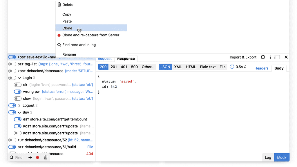
I try switches instead of checkboxes to emphasize that it’s not just a selection, but actually turning things on and off. Also, snuggle the controls to the corners, replace the minus with a trashcan, add a record button for capturing real server responses and using them as mocks later when the server is unavailable:

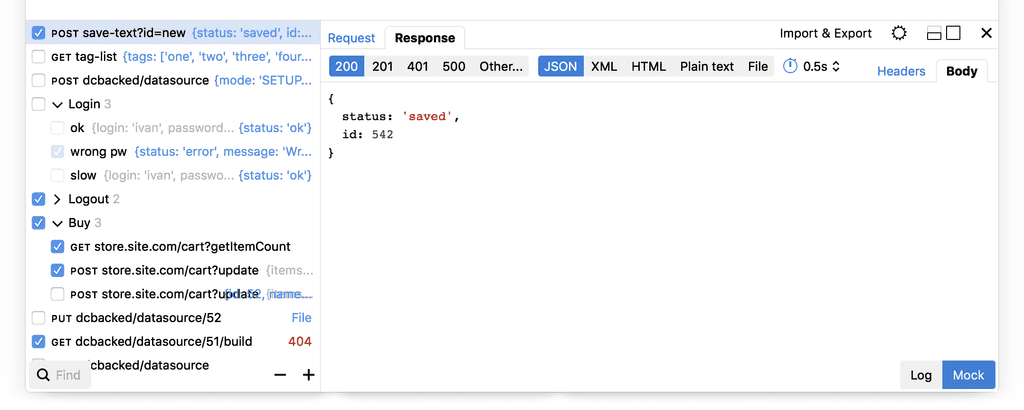
A right-click menu is added to accommodate for some features that do not fit anywhere else.
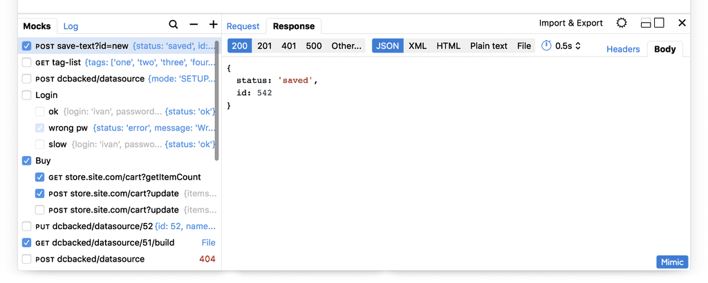
Switches for mocks look too noisy, and I want to come up with something else. Like a checkbox, but not quite. And here it is, the M symbol:

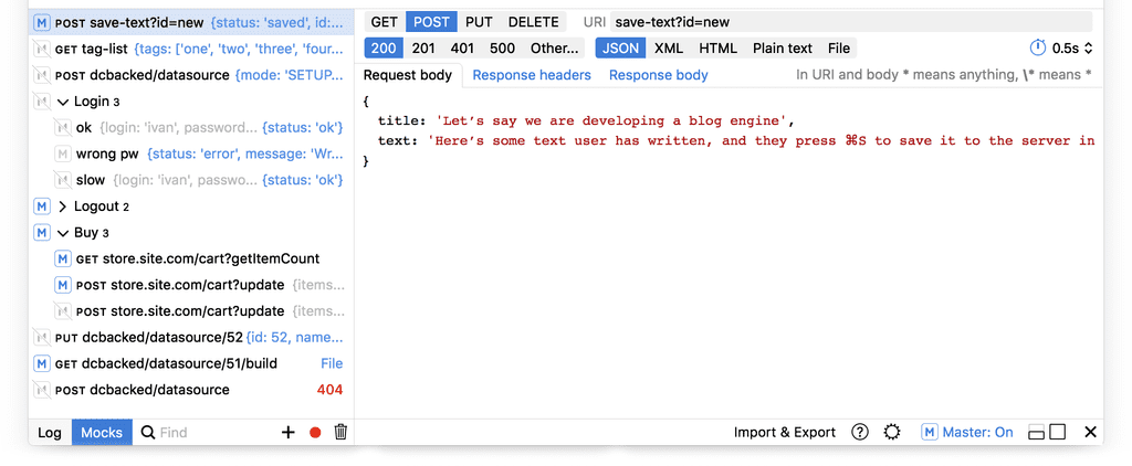
Lots of stuff moves at this point. Log / Mocks switch moves to the left, all toolbars moves to bottom, and two-level tabs hierarchy is flattened. And the Master switch appears in the bottom right corner.
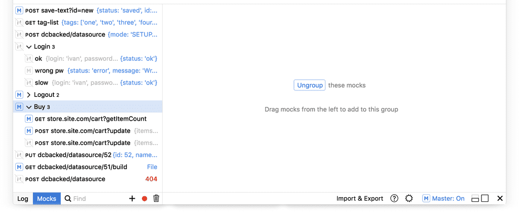
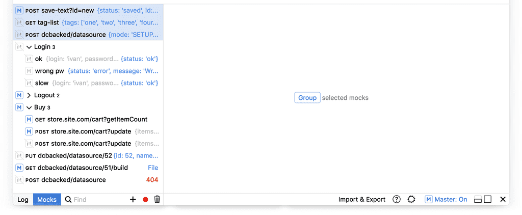
What happens when the user selects a group on the left instead of a mock?

What happens when the user selects multiple things?

And here is what the log looks like:

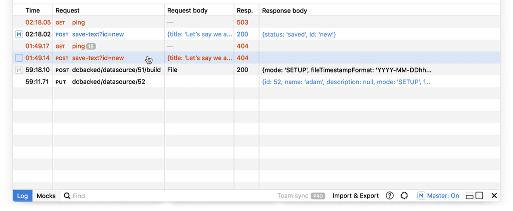
Search works like a filter, leaving just the lines matching the query:

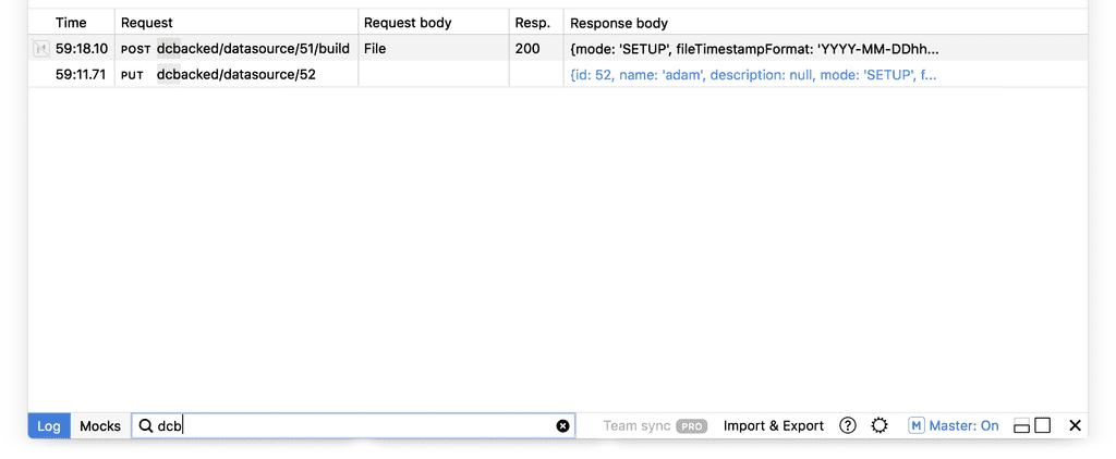
You may switch between Log and Mocks even when search is active:

It was time to get the status bar and Quick Edit in line with these changes. “Log” and “Mocks” are now always visible on the screen:


Request made:


Quick Edit:


The response timeout setting was here in earlier takes (see Take 6 above), but proved to be not that important for Quick Edit, and so was removed.
To be continued.
- info@500tech.com
- HaYetsira 19, Ramat Gan