- info@500tech.com
- HaYetsira 19, Ramat Gan
Earlier this year we released Mimic 2.0, the new version of our open-source dev tool for mocking server responses in a browser.
Front end and back end are often developed separately. While the back end is not working, the front-end developer is very limited in what they can do. But with Mimic, they just mock server responses right from within the browser and develop as if the server was alive.
I made the user interface for the new version. Today I’d like to share with you some of the interim layouts and solutions. This series covers just a small portion of the things that we considered and discussed internally.
The idea to show the outgoing requests live as they were sent was one of the first ones. This helps the developer start mocking their requests without having to deal with the complicated lists and settings. The first sketches looked like this:


The “Mimic” button opens a full-featured mock editor (not yet designed at this point). Clicking the status bar opens the Quick Edit bar:


At first, this may not look quite close to the final design. But that is mostly because of the style. We agreed on the style even before we started the project: we wanted the user interface to look neutral, as if it was part of the browser’s developer toolbox.
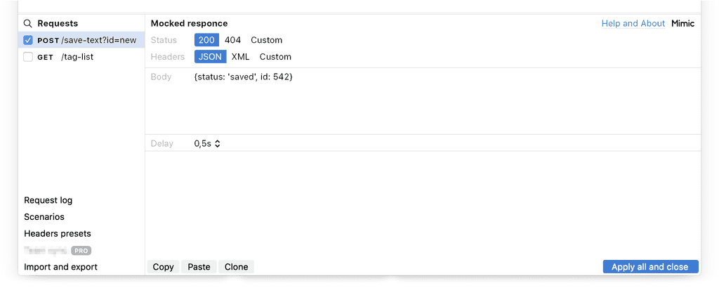
The request method (“POST”) was originally emphasised. But it doesn’t bear that much importance, so it soon became quieter. The checkmark button’s role was not very obvious (it wasn’t even obvious it was a button), so the icon was replaced with the “Apply” button. The very large “On” switch was replaced with a much more modest checkbox next to the “200” status code:


The “JSON” dropdown added here helps quickly select the response headers preset (e.g., Content-Type). This is a popular setting that should not require opening a full-blown mock editor. The “Mimic” button gets removed because “Tune...” also opens the full editor.
Here, the full editor appears for the first time. It’s what opens when the developer pressed “Tune...”:

This is a very early draft, so lots of things are out of place. The menu on the left was is a real menu, but more of a reminder to myself as to what features have to be designed.
Notice the “Scenarios” item in the menu. It was a hangover from the original version of Mimic where a developer could have several mock setups and switch between them depending on the task. It was later removed altogether because of the addition of mock grouping which proved to be both more powerful and easier to use.
Next, we started thinking about using the status bar with an application that send many requests. What if you miss a request that you want to mock and another one comes. How do you mock the previous one without opening the full editor?


We also though the developer could click the request to get the popup list of previous requests to select the one to mock:


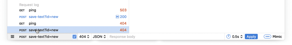
The checkbox next to “404” status code is not easy to understand. It doesn’t read like an “on” switch of a particular mock, but more like some switch related to the status code itself.
The full editor gets reorganised considerably and gets a request log on the left:

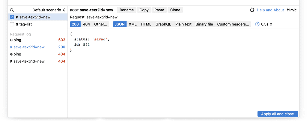
By this time we already have the color coding: the good server responses are black, the errors are red and the mocked requests are blue. The full editor starts to accumulate features like the ability to edit the request URI and Body:

The “Mimic” button reappears for consistency between Quick Edit and the full editor:


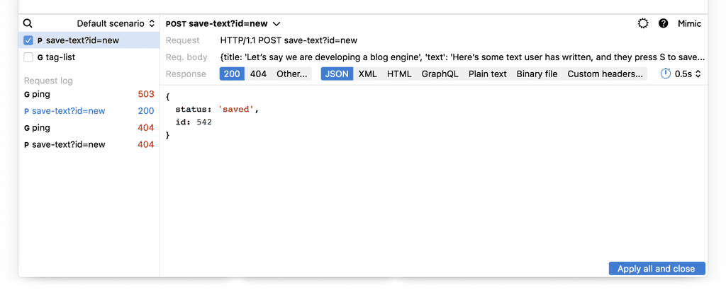
The Previous and Next buttons, added earlier, are now removed. Imagine clicking them in search of the needed request. We replace them with an always-visible button to show the request log:

The request method is further downplayed. The symbolic representation of methods (G for GET, P for POST) turns out to be unpractical: how do you represent PUT? So we change back to full names. Also notice that the checkbox moves from the “404” section to the request section, so now it’s to the right of the request. This is an attempt to make it more obvious that in enables or disables the mock.
To be continued.
- info@500tech.com
- HaYetsira 19, Ramat Gan